2022 Emilia Romagna Grand Prix - Race- Report
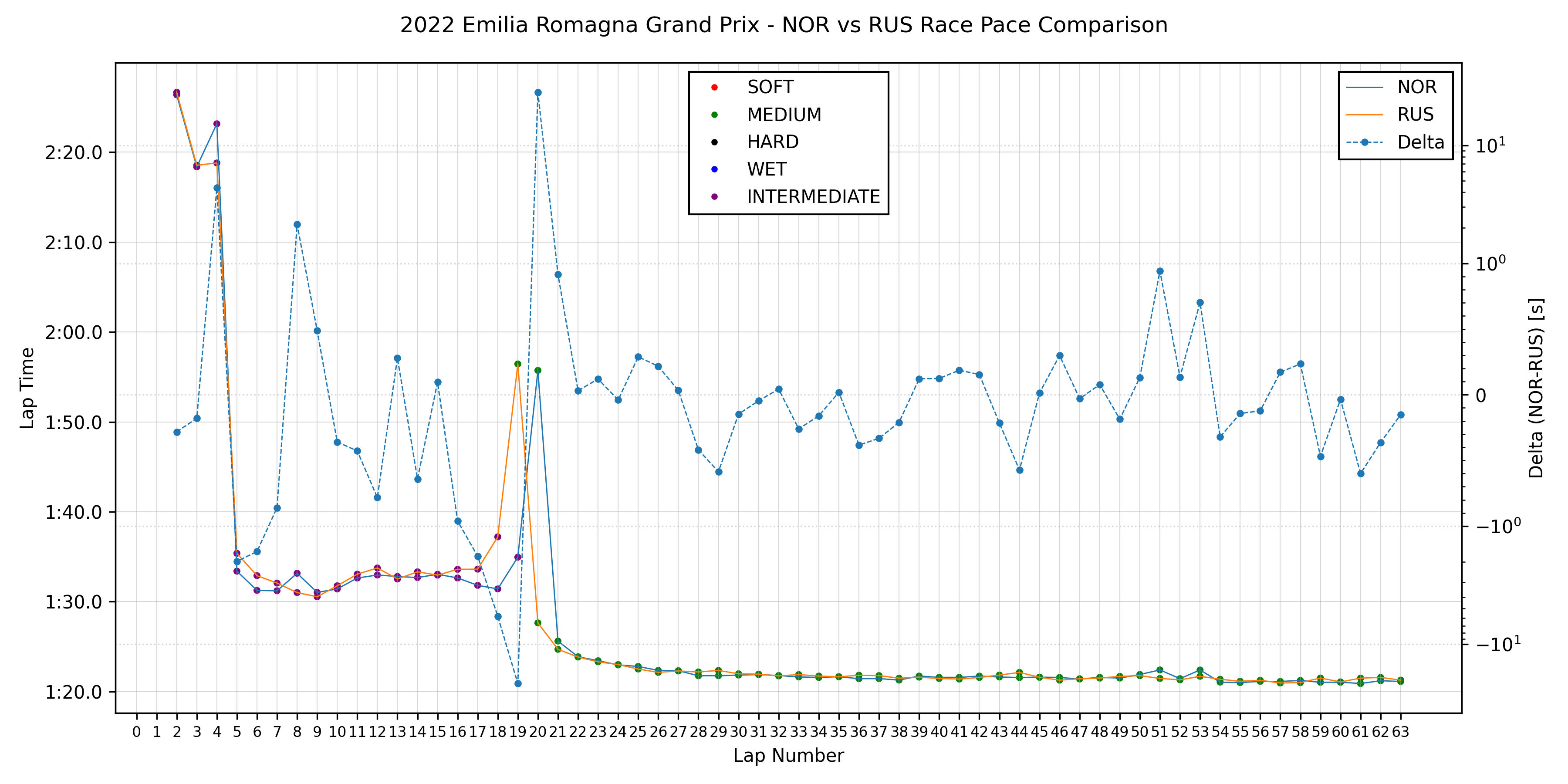
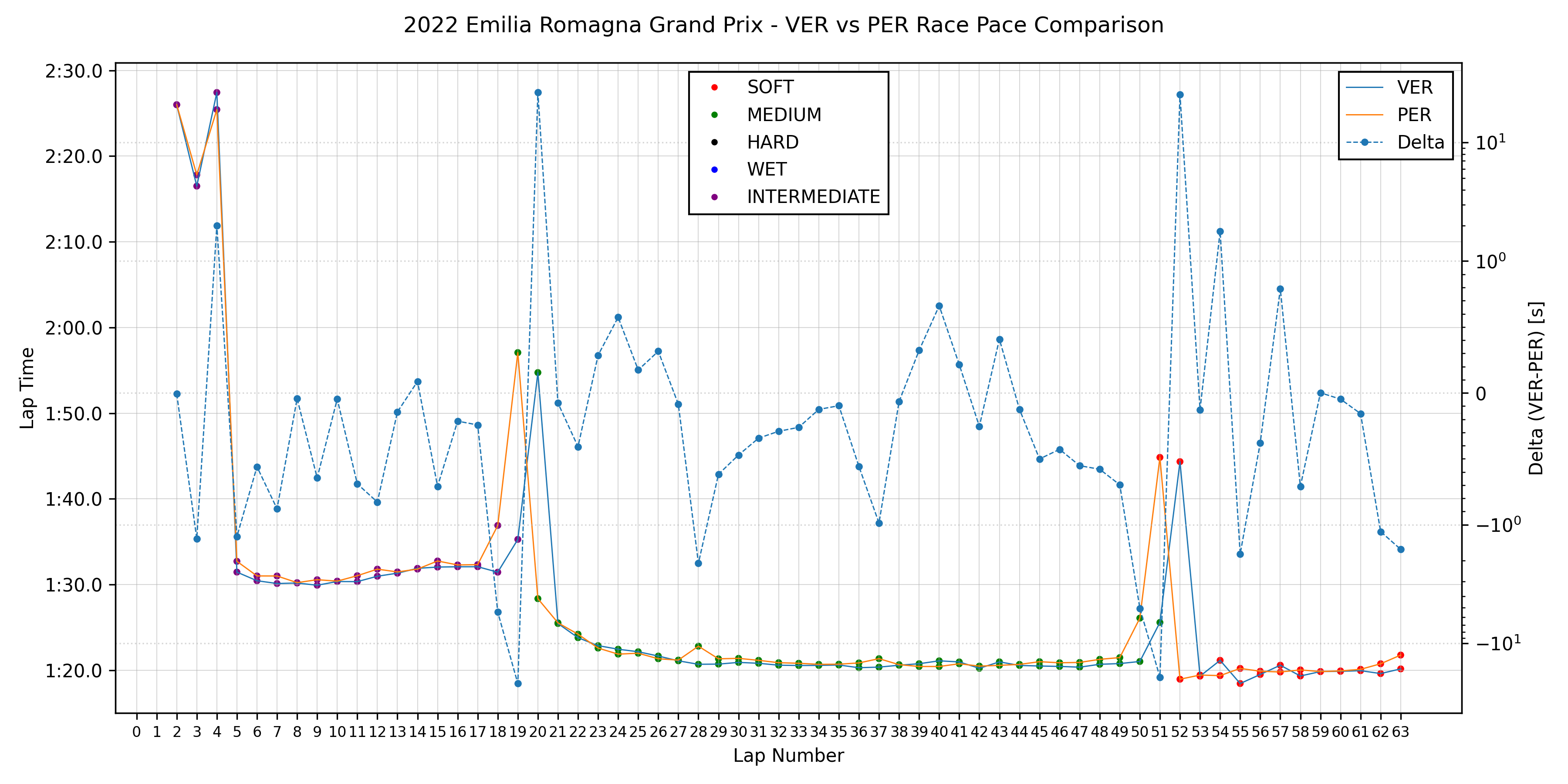
In this post I compare the race pace of the top finishers in the Emilia Romagna GP race. In each of the following graphs the lap times of two drivers over the course of the race are compared. The color of the solid lines indicate to which driver specific lap times correspond (lap times are read on the left axis) and the color of the markers on those lines indicates the tyre compound that was used for any given lap. Also, a dotted line showing the difference between the two drivers lap times is drawn. The scale of the axis of this dotted line (right axis) is linear from -1 to 1, and logarithmic outside that range (remember: 10⁰ = 1 and 10¹ = 10). I chose to use this scale so that time deltas under one second could be read more easily. For cars closely matched in pace time differences are often under one second and small changes within this range better indicate the evolution of the race. This difference jumps dramatically when safety cars (virtual or real) come out or when pit stops ocurr causing the delta line to jump outside the figure or, if made to fit inside the figure, causes the changes within the -1 to 1 range to be less visible.
Furthermore I should point out that there is no lap 1 time recorded for any of the drivers. This is because the lap time of the first lap is considered inherently innacurate. Also, no lap times are recorded during safety car periods so gaps in timing data can be explained by this. Keep in mind DNFs that ocurred during the race..
Blue dots on the dotted line do not indicate a tyre compound. They are only there to aid the reading of the time delta.
Having said all that, here are the graphs.